Is Your Bathroom Living in the Past?
By Nisha MacNeil, Design Manager
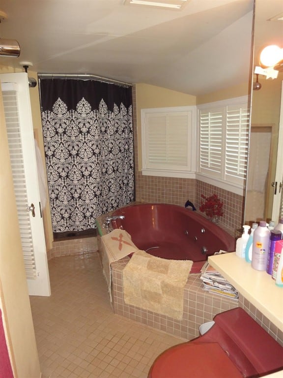
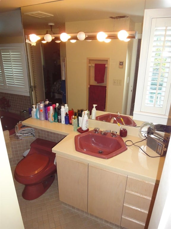
We recently completed this bathroom renovation for a client. The bathroom was dated and tired. The burgundy fixtures had to go as well as the black patterned shower curtain which closed off and darkened the space.
The design strategy
Bathrooms are one of the more expensive rooms to renovate so my design strategy is typically to stay neutral and timeless. You can always add softness, different colours and styles with towels, blinds/curtains or artwork.
Cream and grey undertones
With this bathroom, I decided to pick a base that has both cream and grey undertones as it opens the palette to many design choices and colours. It allows the room to feel clean but still warm, not clinical.
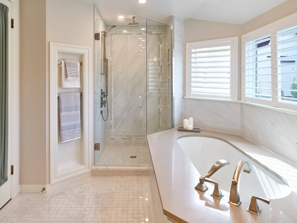
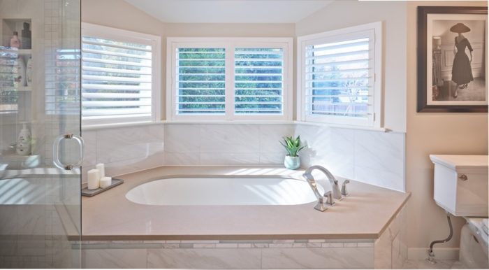
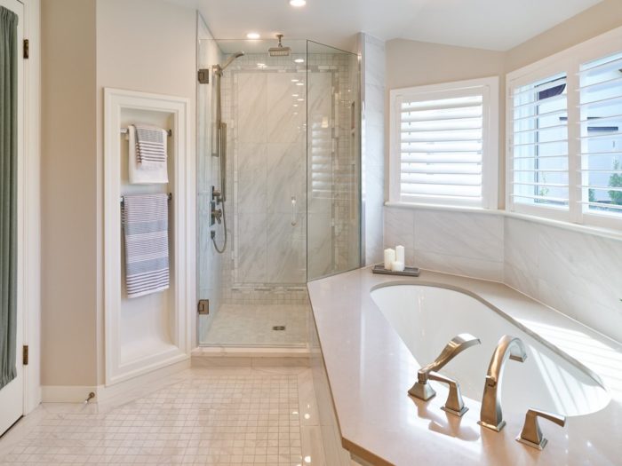
So, we opted to use a creamy, grey statuario marble-look porcelain tile, which we employed in several different formats to give texture and interest to the space.
Variety of tile sizes
We utilized a large format of this tile for the tub surround and shower walls. The floor was laid with a 2×2 mosaic because the floor plan had a very odd and angular shape. The whole room was bordered in the larger tile format, cut down to 3″ wide tiles to give a clean and traditional feeling to the room.
On the shower walls, we included a border of mixed stone and frosted glass tile and then another border of the 2×2 floor tile.
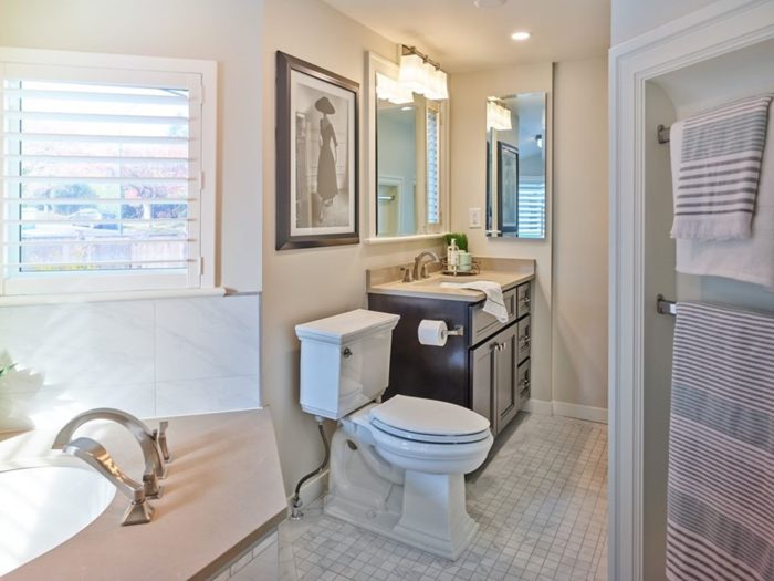
To add warmth, we selected sandy-coloured quartz for the tub deck and vanity top.
New window added
It is not shown in the before photos but only two of the three-bay walls around the tub had windows. To add symmetry to the bathroom design, we added the third window which brightened the room immensely.
Contrasting elements
For the vanity, we chose a dark stained maple cabinet. This element provides sharp contrast and makes the space feel really alive. A white vanity could have been used, but the space would have fallen flat and felt too cold.
We also added towel niches to make the space feel bigger and added traditional detail with their cased openings. The space was narrow so these really work well.
The vanity mirror also uses the same window casing, continued around the window beside it so it feels very custom.
Good for 100 years
All in all this bathroom now feels updated, timeless, clean and bright. It will feel this way for the next 100 years because of the decisions we made during the design process.

